The Challenge
“Nature’s Scent” was a local provider of 100% handmade soaps and cosmetics, mainly targeting the Israeli market. Driven by a passion for creating top-quality, completely natural and organic products, with a vision of global expansion, it was apparent that the brand needed a new identity, including brand architecture, name and message.
The Result
Faran has achieved global success, entering numerous international markets.

Graphic Design: FIRMA
My Work
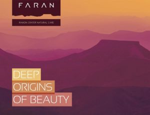
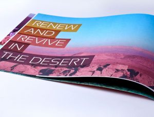
The brand strategy all creative applications were derived from the company’s natural surroundings, along the majestic Ramon Crater. This natural desert wonder served as the inspiration for the brand’s name, “Faran” (a river flowing in the area), as well as the graphic design, while the brand essence, “Respect The Path” reflects the organic approach of working with the skin’s natural assets. My work also included the definition of a systematic internal hierarchy of the product lines, to address different needs and audiences.
